Refreshed brand identity for national healthcare charity The Pituitary Foundation
STRATEGY | BRANDING
The Pituitary Foundation is the largest provider of information and support for pituitary patients and their carers in the UK. They needed a refreshed and more accessible brand identity to increase engagement in their work and bring them in line with visuals expected of respected charities in the sector. The first job was to discover The Pituitary Foundation’s unique brand personality, kicking things off with workshops and interviews with key stakeholders including staff, trustees, volunteers and medical professionals. Once we had defined the brand story, we moved on to designing a new visual identity and brand toolkit which would help the foundation better promote their services and reflect their expertise in pituitary support, both in the UK and further afield.
Collaborators
• Brand copywriting: Josie Gillingham
• Design support: Becky Root
• Website project management, UX and UI design: Deckchair
• Website build: Appeal Digital


Improving brand recognition with a new logo and strapline 👀
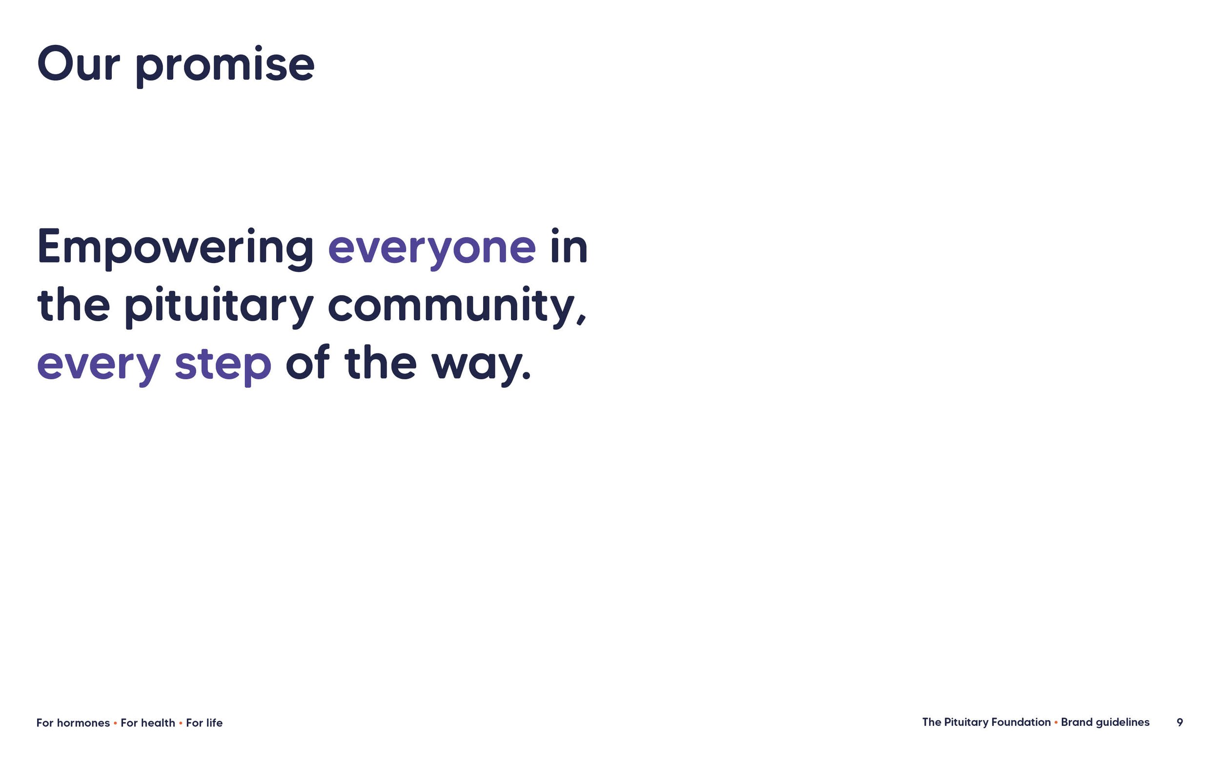
Many people have never heard of the pituitary gland or The Pituitary Foundation. Off the back of research around this problem, we developed the strapline ‘For hormones, for health, for life’. ‘For hormones’ because the pituitary gland controls hormones in the body. ‘For health’ indicates that The Pituitary Foundation are a health charity. ‘For life’ expresses the idea that pituitary conditions are often lifelong and the foundation exists to support people throughout their whole pituitary journey.
The charities members told us that they liked how the dot in the existing logo represented the pituitary gland, so we brought this through into the new logo, using the dot as a key feature of the brand mark.
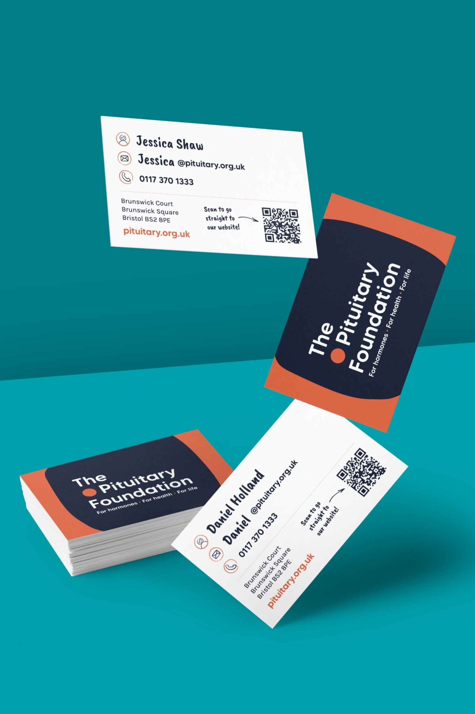
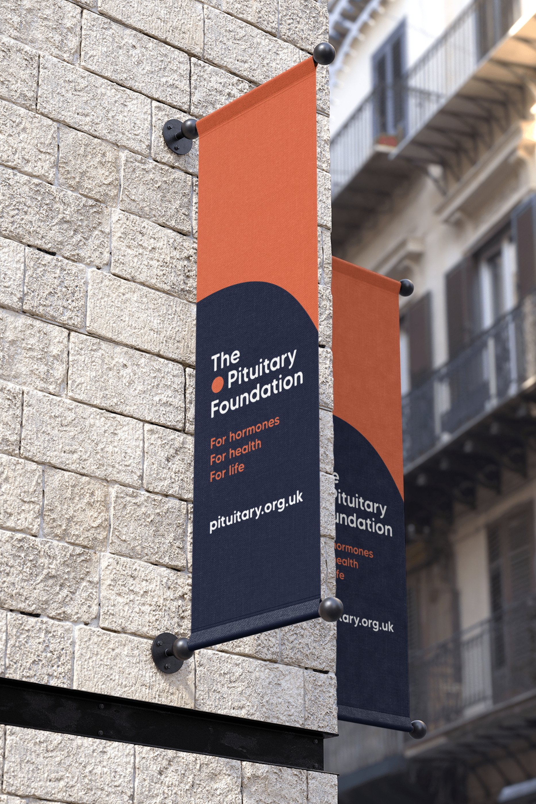


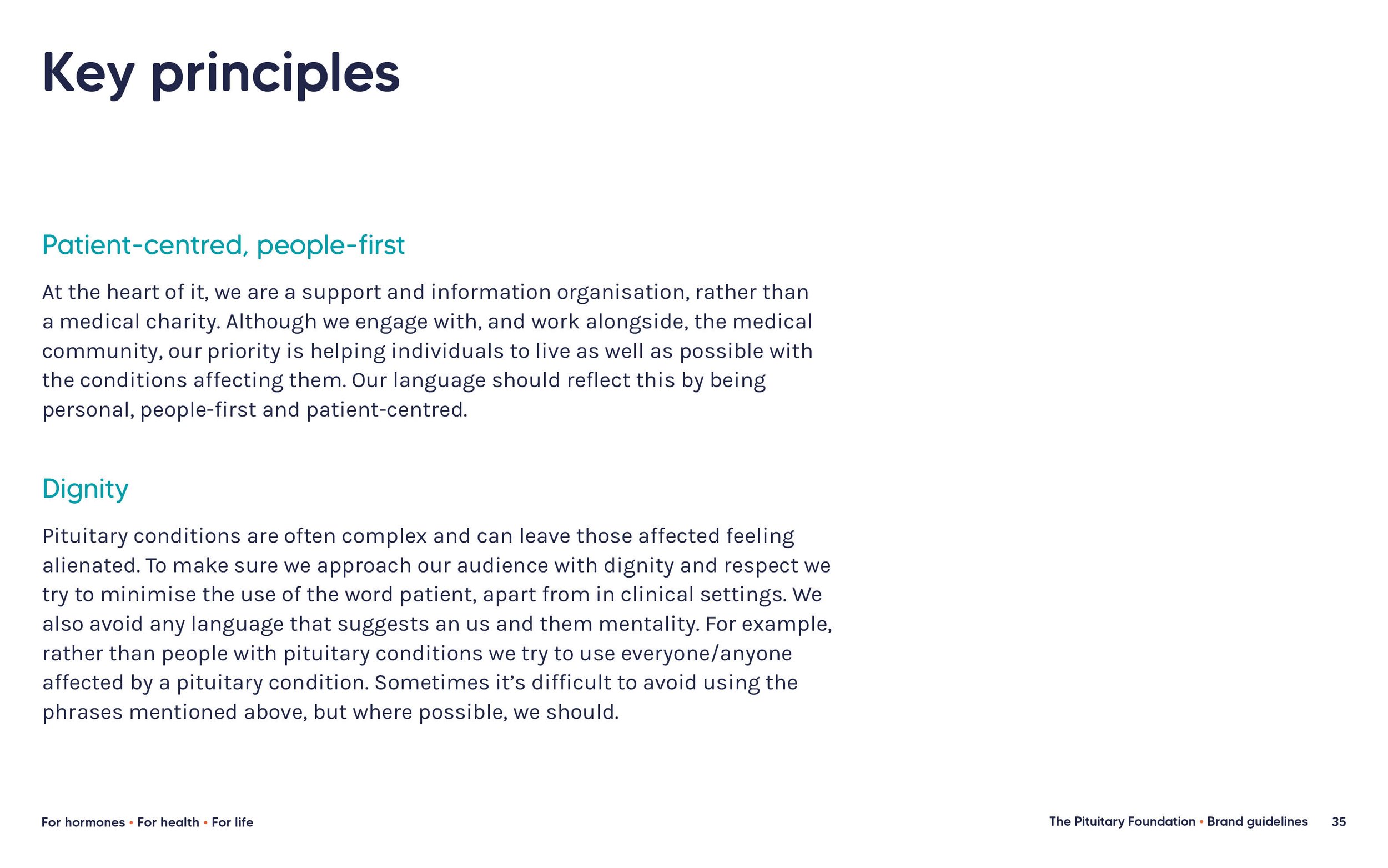

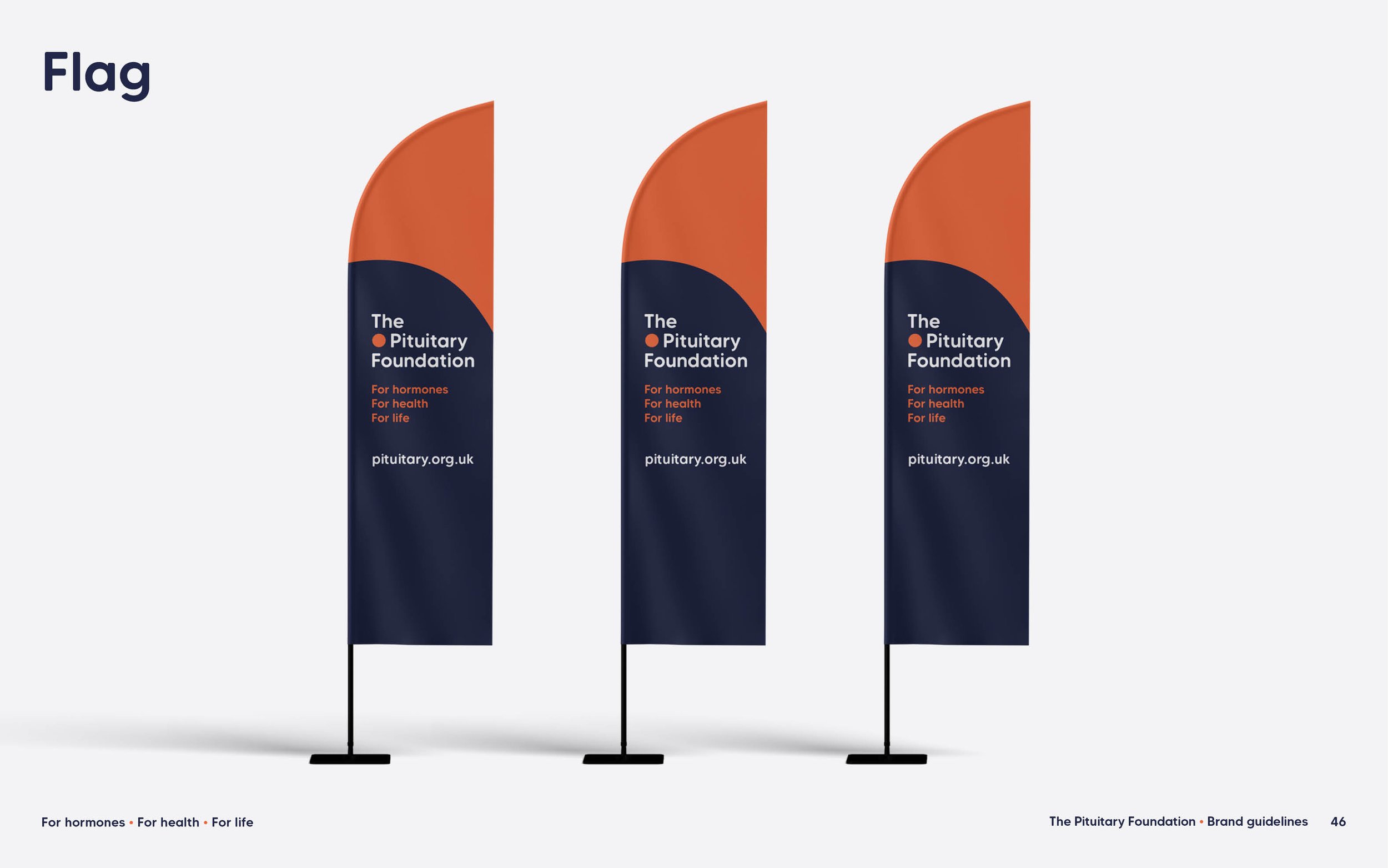

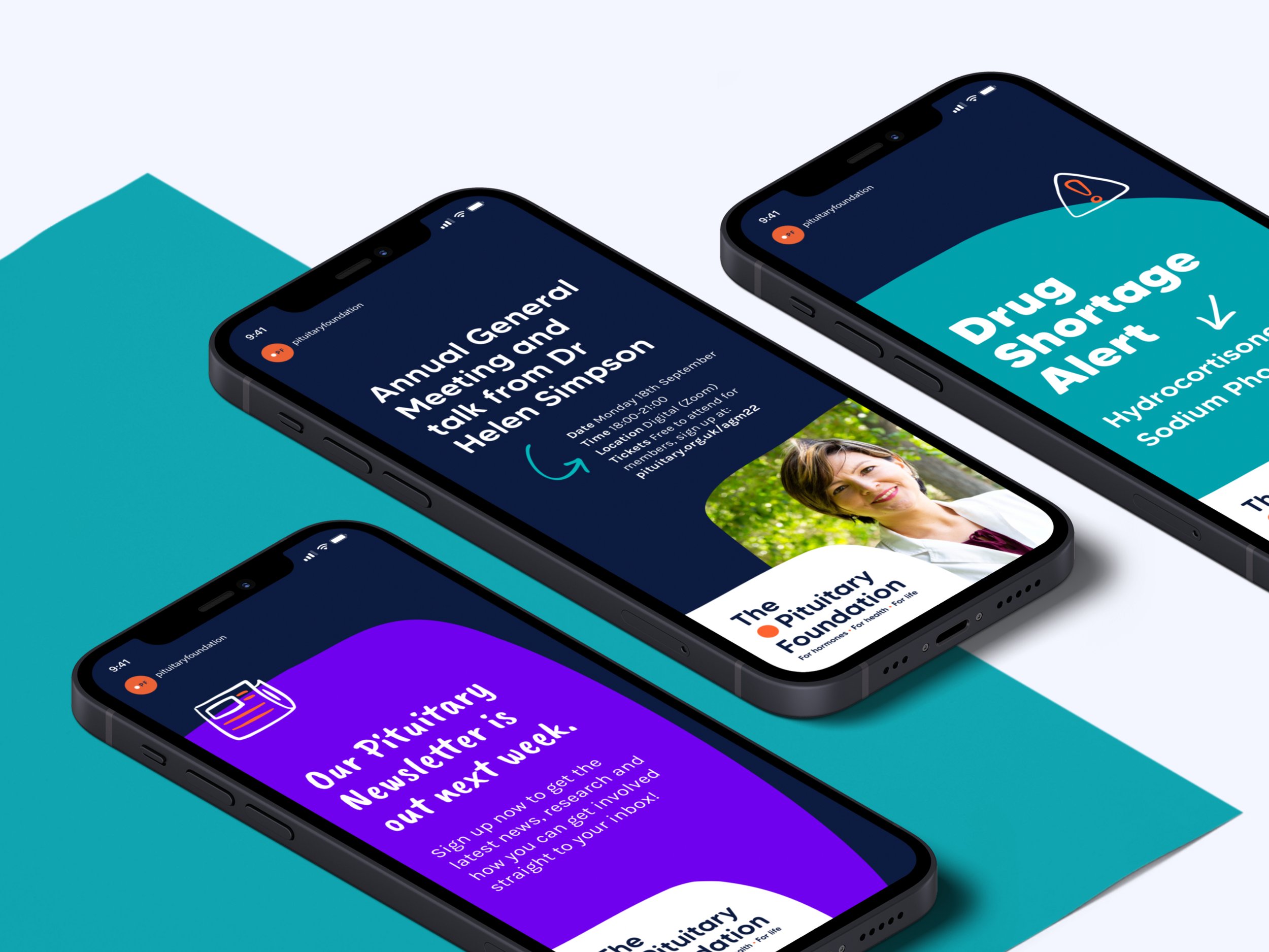
With a small but mighty team, The Pituitary Foundation needed a toolkit which would allow them to create brand materials with limited time and resource. We also needed to consider how and when the charity connected with their audience – a relaxed and approachable style on social media, a more formal and empathetic approach in hospitals and other healthcare settings, and a direct and bold voice in the fundraising space – so it was really important that the identity could flex. As well as rolling the brand out onto stationery, merchandise and other materials, we also created templates for social channels, reports, information booklets and presentations.
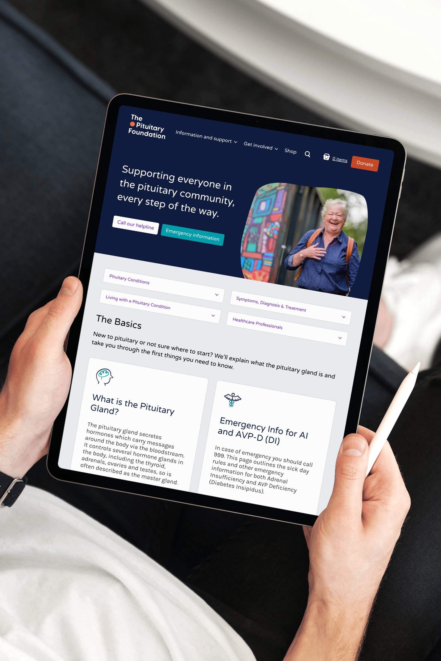
It was great to work alongside user experience agency Deckchair who were managing the website project with Appeal Digital on development. They did an amazing job translating the new identity onto the site, which is now a valuable resource for pituitary patients, heathcare professionals and the whole pituitary community.
A usable brand toolkit that can flex 💪